
Interior Design
Color of the Year 2026 : Interior Paints
Rich Neutrals & Nature-Inspired Tones Take Center Stage | 2026 Colors of the Year:
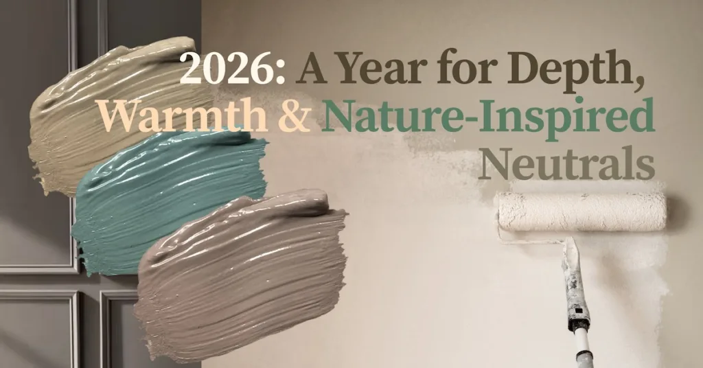
Each new year brings a fresh wave of color inspiration, and 2026 is shaping up to be a year defined by warmth, depth, and serenity. Leading paint brands — Behr, Benjamin Moore, and Sherwin-Williams — have unveiled shades that reflect our collective desire for grounded, nature-inspired living spaces. These colors move beyond sterile whites and cool greys, inviting more personality and calm into our homes. Whether you’re planning a full room makeover or simply want to update a single wall, the 2026 Color of the Year selections offer plenty of inspiration.
Behr – Hidden Gem (2026 Color of the Year)
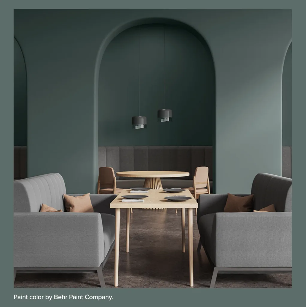
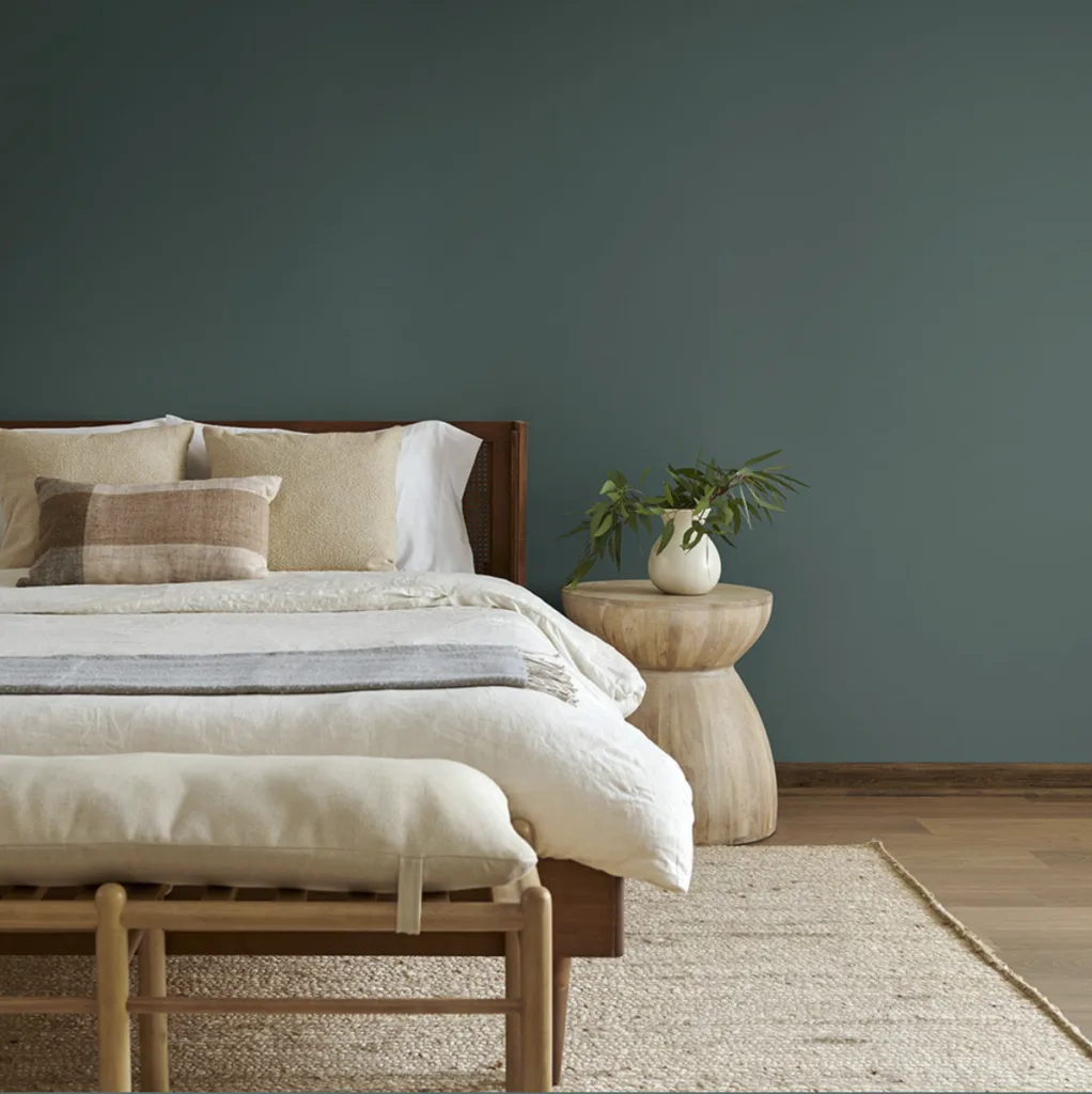
Behr has officially announced their 2026 Color of the Year: Hidden Gem. The shade is described as a “smoky jade” — a refined intersection of blue-green hues. It’s positioned as a new neutral, retaining the versatility of traditional neutrals while introducing richness and personality.
This timing makes sense: as people continue to seek serenity and connection to nature in their home, a hue that blends green and blue feels both calming and rejuvenating.
Why it works in interiors:
- Deeper and richer than pale greens or greys, Hidden Gem creates atmosphere and mood — ideal for color-drenched walls, accent cabinetry, or dramatic ceilings.
- It complements wood tones, brass, and natural textures like boucle, linen, or rattan — perfect for sustainable, timeless interiors.
- It can serve as either a backdrop or an anchor: pair it with light furnishings for balance or use it boldly in a cozy study or library.
Tips for using it:
- Try Hidden Gem on a feature wall, with off-white or cream trim for contrast.
- In low-light spaces, choose an eggshell or satin finish to maintain softness.
- Pair with warm woods like walnut or alder for a refined, grounded look.
Benjamin Moore – Silhouette (2026 Color of the Year)
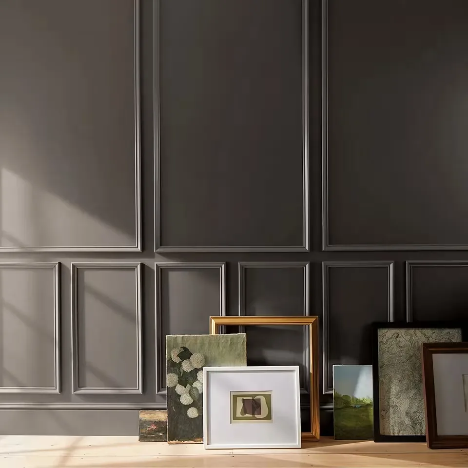
Benjamin Moore’s 2026 Color of the Year, Silhouette (AF-655), is a rich espresso brown softened by charcoal undertones — a deep neutral that radiates sophistication. This choice highlights the evolution of neutrals toward warmth and complexity.
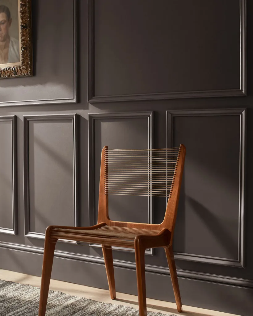
Why it’s a strong choice for interiors:
-
Its warm undertones pair beautifully with natural wood furniture, complementing rather than competing with it.
-
Works seamlessly in living rooms, bedrooms, or cabinetry — creating depth without feeling overpowering.
-
Serves as a luxurious anchor color, especially when balanced with lighter upholstery, textiles, or metallic accents.
Usage ideas:
- Use Silhouette as an accent wall behind a bed or sofa, contrasted with lighter walls.
- Apply it to cabinetry or built-ins for a modern, custom look — stunning with brass or matte black hardware.
- Combine with warm wood furniture for a timeless, layered aesthetic.
Sherwin-Williams – Universal Khaki (2026 Color of the Year)
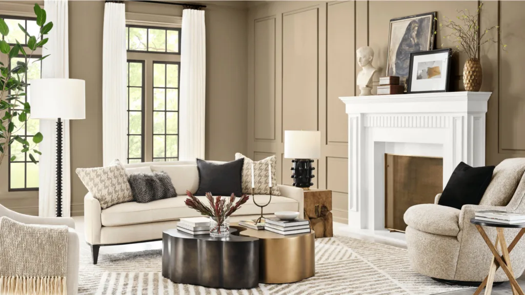
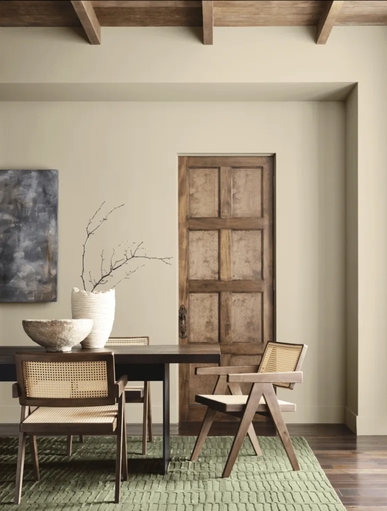
Universal Khaki is Sherwin Williams’ color of the year for 2026. This warm beige-taupe neutral is meant to feel adaptable, comfortable, and enduring — a color that quietly enhances any room.
Why it’s relevant to interiors:
-
Perfect for pairing with sustainable, solid-wood furniture — its warmth allows natural materials to shine.
-
Fits a wide range of styles, from transitional and Scandinavian to classic or mid-century modern.
-
Offers timeless appeal thanks to its subtle depth and earthy undertone.
How to layer it in a space:
- Paint entire rooms in Universal Khaki for a soft, cohesive backdrop.
- Use natural textures — linen, jute, or reclaimed wood — to build warmth and character.
- Add pops of color through accent décor, like terracotta pottery or jewel-toned cushions.
Bringing It All Together
If you’re planning a refresh or choosing paint to complement solid-wood, sustainable furniture, here’s how to decide among 2026’s standout shades:
-
Want a statement, mood-rich backdrop? Choose Behr’s Hidden Gem.
-
Prefer a dramatic yet neutral feel? Go with Benjamin Moore’s Silhouette.
-
Need a timeless, adaptable foundation? Sherwin-Williams’ Universal Khaki delivers.
Keep in mind how lighting and finishes affect perception. Deep hues like Hidden Gem or Silhouette shift throughout the day, while warm neutrals like Universal Khaki remain steady and inviting. Pair these tones with natural textures, organic materials, and layered lighting for a space that feels intentional and serene.
Final Thoughts
2026 marks a turning point for color in interior design — where neutrals gain soul and bolder tones feel grounded in nature.
-
Behr brings depth and calm with Hidden Gem, a smoky jade that bridges blue and green.
-
Benjamin Moore introduces Silhouette, a modern take on dark espresso neutrals.
-
Sherwin-Williams champions Universal Khaki, a warm neutral for timeless appeal.
Whichever direction you choose, these shades encourage thoughtful, sustainable design — creating spaces that reflect both style and substance.